When readers land on a blog and stay longer than they expected, it usually isn’t because of a single post. It’s because the design creates an experience that feels easy, natural, and trustworthy—without drawing attention to itself. These subtle choices shape behavior in ways readers may not consciously notice.
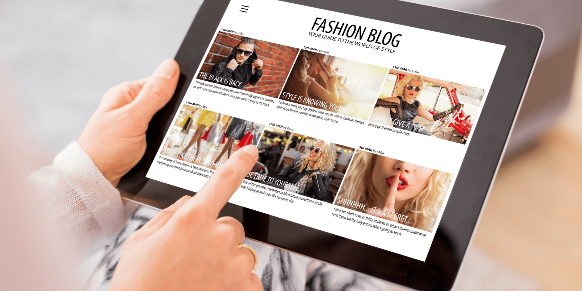
Clean Blog Layout Increases Time on Page
Readers stay longer on blogs with clean, well-structured layouts. A clutter-free design removes distractions and helps them focus on the content.
Imagine someone skimming your blog during a short break. If the layout feels crowded or confusing, they leave. But when everything feels in place—headings, text, images, and spacing—they keep reading without effort. Clean design doesn’t need to stand out. It simply allows the content to shine. That invisible support is what makes it effective.
Consistent Visual Elements Build Reader Trust
Consistent use of fonts, colors, and spacing tells readers they’re in the right place. It gives the blog a steady tone, which increases comfort and confidence.
A reader may not stop to think, “This font feels reliable.” But they feel the impact when every part of the blog looks aligned. If one page feels modern and another feels outdated, trust breaks down. Subtle consistency makes the design feel stable—and that stability encourages longer visits and repeat readers.
Intuitive Navigation Encourages Deeper Exploration
When readers can move through your blog without stopping to think, they stay longer. Clear menus, logical post flow, and visible categories create a sense of control.
If a visitor lands on a post and sees a path forward—through related posts, breadcrumbs, or well-placed links—they continue exploring. They don’t pause to evaluate the structure. They simply act because the design guides them. That flow turns a single-page visit into a multi-page session, increasing engagement without effort.
White Space Reduces Visual Fatigue
Strategic white space helps readers process your content without feeling overwhelmed. It gives the eyes room to rest and separates different parts of the page clearly.
Imagine a reader scrolling late at night. Dense blocks of text with no breaks feel hard to follow. But if the blog uses space between paragraphs, headings, and images, it feels easier to read. White space doesn’t draw attention to itself—it makes everything else easier to notice. That sense of ease is what encourages readers to keep scrolling.
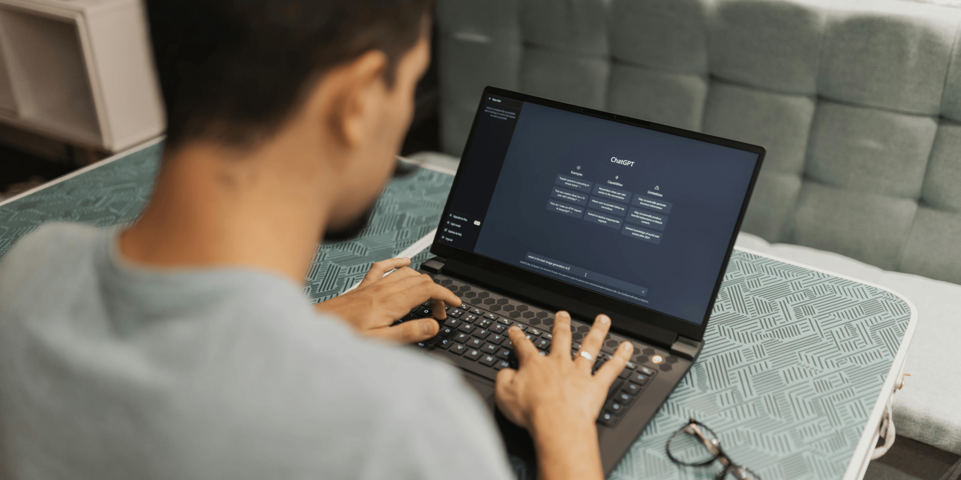
Mobile-Friendly Design Enhances User Experience
A responsive design keeps readers engaged on all devices. If your blog adjusts smoothly to mobile screens, visitors stay longer and interact more.
Picture someone reading your blog on their phone during a commute. If the text is too small or images don’t scale, they bounce. But if the mobile view loads quickly, displays properly, and feels just as smooth as the desktop version, they stick around. Mobile-friendly design isn’t flashy—but it quietly supports trust, clarity, and usability.
Fast Load Times Reduce Bounce Rate
Speed matters. A blog that loads quickly keeps readers from getting frustrated or distracted. Load time plays a key role in how long visitors stay.
If a reader clicks a link and the page appears instantly, they keep going. They don’t think about load time unless it’s slow. But once the site delays, they start to question whether it’s worth the wait. Fast blogs make the experience feel seamless, and that smoothness keeps visitors engaged.
Visual Hierarchy Directs Attention Without Distraction
A strong visual hierarchy uses headings, font size, and design contrast to guide readers through content. When done well, it feels invisible but effective.
Readers don’t want to work to understand your message. If the main points are clear and the supporting content easy to follow, they move through the post naturally. Visual hierarchy gives readers cues on where to focus and how to move forward. It doesn’t just improve reading speed—it keeps visitors engaged without pulling their attention in too many directions.
Clear CTAs Feel Helpful, Not Pushy
Calls to action should feel like part of the content, not interruptions. When readers find them where they expect—and when they align with the content—they respond without hesitation.
Let’s say a visitor reaches the end of your blog. A clear CTA to read a related post or join a mailing list feels helpful when it flows naturally from the content. When CTAs match tone, style, and layout, readers trust them. Design supports that trust by placing these prompts where they feel logical—not forced.
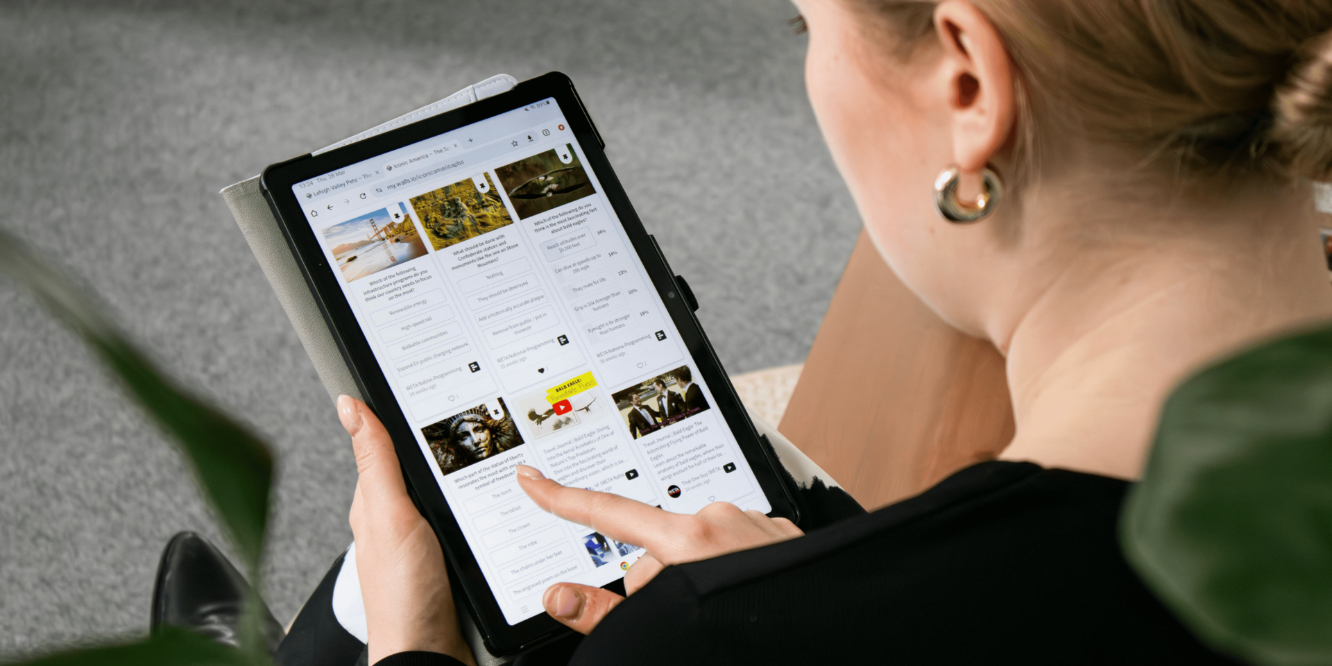
Image Placement Reinforces Message Clarity
Images placed with purpose help break up text and clarify meaning. But their positioning, size, and alignment also impact reader focus.
If images appear randomly or crowd the layout, they confuse the reader. But when visuals sit near the relevant section, sized and spaced correctly, they support the message. That balance doesn’t call attention to itself—it keeps the reader connected to the content. Readers may not realize the design choice, but they respond to it with longer attention spans.
Typography Shapes Readability and Retention
Font choices affect how long a reader stays with your blog. If the text feels too small, hard to scan, or inconsistent, visitors lose interest quickly.
When typography is simple, clean, and used consistently, it supports retention. Readers feel more relaxed and confident moving through your content. They don’t notice the font directly—but they notice the ease. That subtle design quality improves reading flow, which increases engagement.