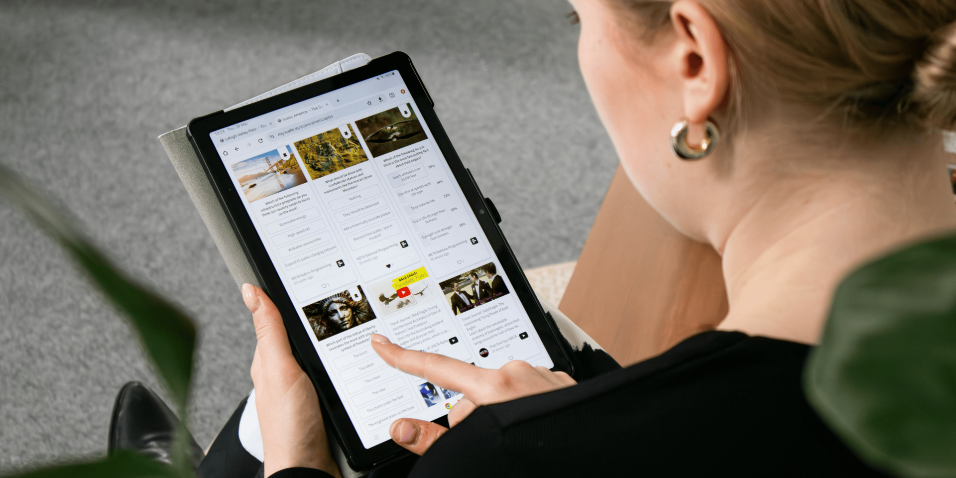
A blog’s content isn’t the only thing that keeps readers engaged. The design behind the words—often unnoticed—plays a key role in shaping trust and guiding attention.
The First Seconds Determine Reader Trust
When a reader lands on your blog, they decide whether to stay or leave in the first few seconds. Invisible design elements like spacing, layout, and typography shape that decision before they even read the first line.
Picture a visitor opening your blog at 7:45 a.m. with coffee in hand, skimming headlines before work. If the content appears cluttered, hard to scan, or poorly aligned, they will click away. But if the page feels clean, consistent, and readable, they continue. That impression forms subconsciously, but it determines whether your blog earns their attention.
Clean Layouts Reduce Mental Load
A cluttered design makes readers work harder to understand your message. Clean, invisible design reduces friction and helps readers focus on the content.
Every element on the page competes for attention. When you remove distractions—unnecessary banners, mismatched fonts, inconsistent spacing—you reduce mental effort. A reader who isn’t fighting through chaos stays longer, scrolls more, and builds confidence in your message. The layout doesn’t need to be flashy; it needs to be clear.
Typography Signals Professionalism
Fonts do more than display words. They signal credibility, tone, and intention. Invisible content design uses typography to support the voice of your brand.
If your blog uses inconsistent font sizes or colors, readers lose focus. Their brain interprets the disorganization as untrustworthy. On the other hand, readable fonts in the right size help guide the eye and keep readers on the page. When typography is consistent across posts, it builds a visual rhythm that supports long-term engagement.
Spacing Guides Reader Flow
Spacing between paragraphs, headers, and images tells the brain where to pause and what to prioritize. When spacing feels off, readers struggle to follow the flow.
Imagine reading a blog on a crowded bus, glancing between stops. You won’t have the patience for dense blocks of text. But if the spacing gives your eyes room to rest, you’ll keep going. Invisible spacing choices either ease your reader forward or cause them to stop reading altogether.
Mobile Optimization Builds Immediate Trust
Most readers access blogs from their phones. If your design doesn’t adapt well to mobile screens, trust drops instantly.
Consider a reader scrolling your blog during lunch at work. If your content requires zooming or horizontal scrolling, they leave. Mobile-friendly invisible design adjusts spacing, font size, and images to fit smaller screens. When a blog looks natural on any device, readers trust the content more because they don’t feel inconvenienced.
Visual Hierarchy Directs Attention
Invisible design sets a visual order. Strong headlines, clear subheadings, and emphasized keywords help readers find what they’re looking for without scanning everything.
A clear hierarchy leads the eye from title to conclusion. Without it, readers feel lost or overwhelmed. Your blog should make it easy for someone to skim, stop, and dive deeper—without confusion. This organization gives them confidence that their time is well spent.
Consistency Creates Brand Reliability
Every design choice should feel like part of the same story. Consistent design elements across all your blog posts build brand recognition and reader comfort.
When readers come back to your site, they expect visual stability. That consistency—same layout, same spacing, same style—helps them trust what they’re reading. It shows that you care about the details, and that care transfers to how they view your message.
Loading Speed Reflects Site Integrity
Invisible content design also includes how quickly your blog loads. Long loading times signal poor optimization and cause readers to bounce before reading.
Picture someone searching for solutions at the end of a long day. If your blog takes more than a few seconds to load, they won’t wait. Optimized design keeps code clean, images compressed, and unnecessary scripts out of the way. When your site loads fast, it reflects reliability and respect for the reader’s time.
Clarity Outweighs Visual Effects
Overdesigned blogs with flashy transitions, animations, or cluttered effects often lose readers. Clear and minimal design builds more trust because it prioritizes the message.
Readers visit your blog for information, not decoration. Invisible design focuses on usability, not entertainment. When readers can easily navigate, read, and understand your post without distraction, they stay longer—and they come back.
Trust Is Built Through Frictionless Experience
Every time a reader clicks, scrolls, or reads, they make small judgments about your credibility. Invisible content design removes friction from those experiences.
Let’s say a reader finishes your post and wants to read another. If your blog suggests a related post in a clean, visible way, they click it. If instead they have to search, backtrack, or guess where to go next, they won’t. Seamless transitions between content create a sense of ease—and that ease builds trust.


